Even if you skim casually through the pages of Astronomy, you can’t help but notice the crucial role the art staff plays in the design, illustrations, and overall feel of the magazine. A lot of work, planning, and talent go into their effort.
I’m not an artist, but I’d imagine that our subject matter at Astronomy is really challenging stuff for an art staff. Yet our crew seems to take it completely in stride.
If readers could sit in on the illustration meetings built into our planning process, they might quietly chuckle to themselves, as I often do. There, our art director, LuAnn Williams Belter, and illustrator, Elisabeth (Roen) Kelly, meet with story editors and discuss how to illuminate, in visual form, what are often highly complex topics. It could be gravitational lensing or black holes one month, the universe’s age and cosmic rays the next. If it were me, I’d be asking dozens of questions, wildly scribbling pages full of notes, and wearing a look of perpetual frazzle. But LuAnn and Elisabeth are consistently calm. They listen, ask the story editors some focused questions, usually jot a few things down, do some thinking, and arrive at an illustration plan. With some back and forth with story editors over the next month or so, they get it right. Pretty impressive.
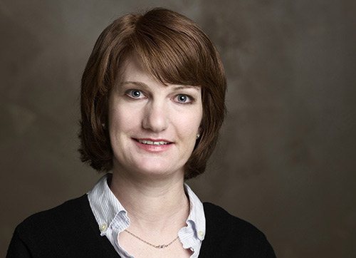
Given their importance to the magazine, I thought I’d give you a brief sketch of our art team and show you what they look like. By the way, they just welcomed a new member, designer Chuck Braasch, who replaces Alison Mackey, who is now working across the hall at Discover. I asked the trio to say a little about their backgrounds as well as the challenges and satisfactions of working on Astronomy. I think you’ll gain a new appreciation of their roles.
 LuAnn Williams Belter, art director
BACKGROUND: My love for graphics began when my father would bring home large, colorful paper pads from the Wisconsin paper mill where he worked. Hours spent filling those pages ultimately inspired me to pursue a degree in graphic design from Cardinal Stritch University in Milwaukee, from which I graduated cum laude.
My professional career was launched at Raintree Publishers in Milwaukee, where I designed books and magazines. I also worked in a 14-year partnership at McDill Design in Milwaukee, an award-winning design studio. Leaving to raise my family, I freelanced for four years and worked part time for Kerlin Design. Since joining Kalmbach Publishing Co. in 2003, I have worked on several different titles, including Art Jewelry, Trains, Classic Trains, and Garden Railways.
THE CHALLENGE: As Astronomy magazine’s art director for the past eight years, my creative challenges are matched with the pressure of budgets and deadlines. I guide designers and illustrators through the magazine layout process, doing a large part of the hands-on design myself. It takes a combination of creative skills and organizational capabilities to keep a steady flow of monthly magazines, special issues, and promotional work on track. With the end product being the world’s best-selling astronomy magazine, the rewards are numerous.
 Chuck Braasch, senior graphic designer
BACKGROUND: I graduated with an associate’s degree in commercial art from Madison Area Technical College in 1997. After working professionally as a graphic designer in Madison for three years, I moved to Milwaukee, where I “temped” at various design firms to get a feel for what Milwaukee has to offer. This led me to temping at Kalmbach in the Ad Services Department, then officially joining the Art Department in 2001. Over nearly nine years, I worked on all of our publications (Astronomy taking up six of those years), short of the jewelry titles.
I then moved on to become senior graphic designer for an equine magazine at a small publisher in Brookfield, Wisconsin, where I expanded my skill set and responsibilities. Now, about three years later, I’ve returned to Kalmbach to strengthen my portfolio while applying my seasoned abilities to Astronomy and Garden Railways. Web design for those titles will be another important focus of mine.
THE CHALLENGE: Time. We’re budgeted a certain amount of time to design each issue, so it’s a challenge to quickly and efficiently deliver an editor’s message in a creative manner while showing that detailed thought was put into the design of the feature and its elements. That’s where creativity and the knowledge of the designer’s software and hardware come into play. It’s all about conveying the editor’s message without showing the effects of a tightly budgeted magazine.
Another challenge I face currently is keeping track of all the details of the magazine’s recent redesign. Spacing, font styles, and the alignment of objects on a page may not be issues apparent to the reader, but they are important factors in a professional publication.
SATISFACTION: The success of my features’ visual appeal in a published issue of Astronomy is where I get my satisfaction. Art is subjective, but if my sense of artistic style is apparent in a layout that my peers accept and enjoy, then I’ve done my job well and expanded my professional portfolio.
 Elisabeth (Roen) Kelly, illustrator
BACKGROUND: I’ve always been interested in art, especially drawing. Both my parents are artists, and when I was growing up, we did art projects all the time.
At the University of Wisconsin-Milwaukee, I received a bachelor’s degree in drawing and painting. Soon after, I was accepted into a medical-illustration program at the University of Toronto. We took gross anatomy, sat in on surgeries and autopsies, and became proficient in illustration techniques.
In 1996, I was hired at Kalmbach Publishing as an illustrator. Kalmbach publishes many train-related magazines, and one reason I got the job is because my portfolio included an illustration of a dislocated wrist that compared it to a derailed train.
THE CHALLENGE: Many of the subjects we feature in Astronomy cannot be seen with our eyes. They are either too far away, too far in the future, or too far in the past. They may be too large, too small, or made out of materials that are impossible for us to see with the makeup of our vision. But based on scientific research, we know that these subjects exist and behave in interesting ways. My job is to explain them beyond just the word descriptions. Bring them to life in pictures. Create illustrations of stuff you cannot visualize. It is a fantastic challenge.
SATISFACTION: I love dissecting paragraphs of text and making pictures out of them, collaborating with editors and authors to make sure it is an accurate interpretation, then collaborating with the designer to make the art mesh with the story and make it look interesting on the page. When you solve all the problems and succeed with a magazine that engages the readers, it is extremely satisfying